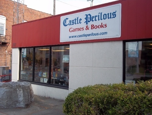
Rolling for Initiative is a weekly column by Scott Thorne, PhD, owner of Castle Perilous Games & Books in Carbondale, Illinois and instructor in marketing at Southeast Missouri State University. This week, Thorne explains what matters in game packaging.
I had the opportunity to try out a comparatively new game from a very small game company this past weekend, so small they only have the one game out but with plans for expansions over the coming couple of years. After playing, I offered a couple of suggestions on how to package the game so as to make it more salable to the consumer in a brick and mortar store.
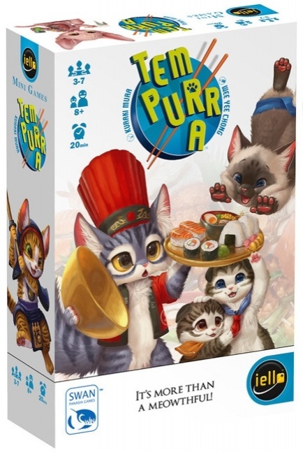
1. Size Matters. While small tuck boxes are certainly cheaper and work fine for a game that a publisher only plans to sell online, as the digital image of the box can be any size you want, in a store such a box easily gets lost on the shelf. For visibility, many game publishers have moved to double-sized tuck boxes such as AEG uses for its Love Letter line of games or Iello for Tempurra. Another way to increase the footprint of a small game on the shelf is through packaging it with a display box, as both Looney Labs and Grandpa Beck’s do with their lines of games. Packaging small games in a display unit has the added advantage of encouraging the store to purchase multiple copies of the game.
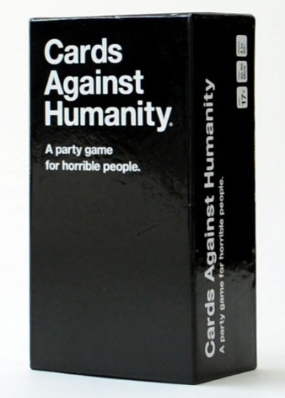
2. The Cover Matters. As with number 1, this is much less important if you are only selling the game online, since, due to the essentially infinite nature of the Internet, you can include as many photos of the box and contents as you wish. You can even post videos showing people playing the game and how much fun they have with it, and as for testimonials, you can post them on your website or your Amazon or eBay pages until the cows come home. In a store, you have the box cover and back to sell people. A plain box will not sell your game, Cards Against Humanity proving the notable exception. However, CAH first got massive awareness online before making it onto store shelves. Few other games have replicated that success. Walk the counters of your FLGS or even better the game aisle of your local Walmart or Toys r Us and take a look at the boxes there. You will see almost no plain box covers, instead using every color of the rainbow, hoping to entice the customer to pick them up and take a look.
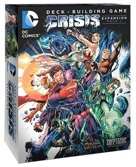
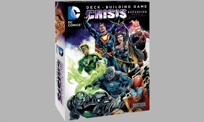
3. Art Matters. Unless going for a deliberately amateurish/old school look, pay or arrange for good art (and offer the artists a decent rate for their work -- it's their job). A black box or one with a single color cover, as noted above, does not attract attention on the shelf. Brightly colored images or figures and good art on the cover do attract attention and help project the image of a quality product. If you managed to get a license, as Cryptozoic Entertainment and Upper Deck did for their DC and Legendary deck building games, so much the better as now you get to put a recognizable character on the box. Oh, and if you won an Origins Award, got played on TableTop or won the Spiel des Jahres, put that on the front cover someplace.
With 40 to 50 new games releasing every month, in order to stand out on a store’s shelves, every little bit helps.
The opinions expressed in this column are solely those of the writer, and do not necessarily reflect the views of the editorial staff of ICv2.com.
Column by Scott Thorne
Posted by Scott Thorne on July 18, 2016 @ 2:23 am CT


