Making the Game is a monthly guest column by Chris O’Neal of Brotherwise Games. Making the Game follows a year in the life of an indie tabletop publisher as they attempt to bring their third game to market. In this month's column on developing a new game, O'Neal looks at commissioning art.
September brings a slight lull in the Brotherwise schedule. Our major conventions are done. The onslaught of holiday orders hasn’t yet begun. We find ourselves with some time to focus on what we love most: making new games – or, as this column is meant to document, making The Game, our third planned (but as of yet unnamed) title.
The Game is coming together so well that we decided to start art development early, and for the past couple of months, we’ve been working some amazing artists to create the look and feel of the new game.
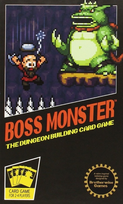
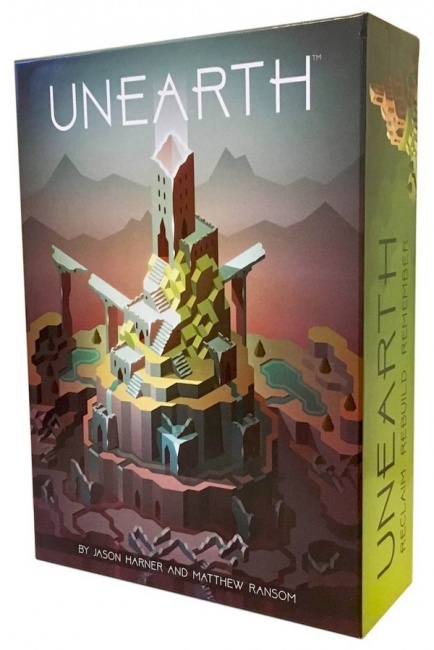
As I discussed in my July column, a huge part of new game development at Brotherwise is about crafting the emotional impact of the game. The core of that comes from its mechanics, but art design completes that package and allows players to really feel something unique. In Boss Monster, we wanted to immerse players in a sense of nostalgia, so our art direction took us into the retro world of pixel art. With Unearth, we wanted to take players on a journey from melancholy to joy. To do so, we start players with an empty, ruined play space that blossoms with color and life as the game progresses. We found the subdued, angular compositions of Jesse Riggle’s isometric vector art the perfect look to execute this visual trick.
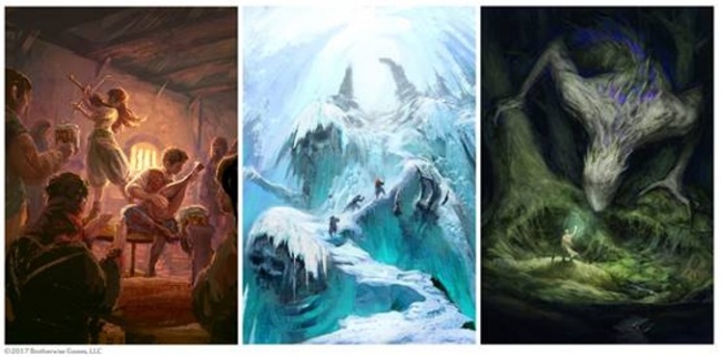
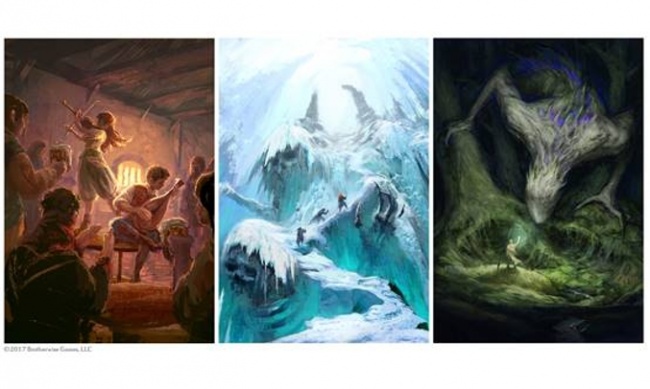
The Game is a game of character building. Without giving too much away, players compete to create the hero who best fulfills his or her destiny by acquiring traits, completing challenges, and facing adversaries. Storytelling is a core part of the game, and we want the dominant emotion of the game to be the delight and pride that comes with watching your hero’s story come to life. To allow players the most room to craft these stories, we’ve chosen a style called "concept art."
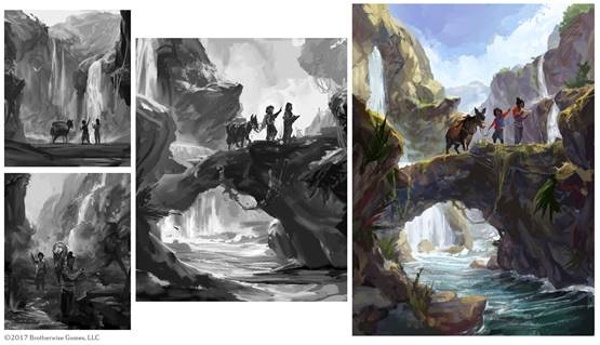
Concept art is familiar to most as the rough, unfinished looking art used to storyboard movies and video games. We knew early on that this open, painterly look was what we wanted for The Game. Broad brushstrokes, deep shadows, and ambiguous figures let players interpret each picture in a myriad of ways. The open art style also means that we can easily insert a variety of settings and time periods into the game without disturbing the visual look. Of course, it was one thing to settle on an art style we wanted, and entirely another to execute it.
For most small publishers, outside of the actual printing, art is the single greatest cost associated with producing a game. Art can be dreadfully expensive and can put a small company in the hole before its game hits a single table. One reason for Brotherwise’s early success is that we kept our illustration costs fairly low. Boss Monster’s pixel art looks great, and has been a huge part of the game’s success, but it was also very affordable by game art standards. In the pixel art world (which is surprisingly robust), a sprite can be commissioned for less than $50. Our entire art budget for the first Boss Monster was less than $5,000.
For Unearth, we felt like we could splurge. There were fewer cards to fill, and we felt good about reinvesting Boss Monster’s gains back into our new game. When we discovered the world of isometric vector artists (also booming), we went for the best artists we could find. Jesse’s broken, angular world was softened by David Pietrandrea’s adorable Delvers, and both artists were worth every penny. In total, we spent something closer to $20,000 on Unearth’s art.
With The Game, we find ourselves worrying again about our art budget. For The Game, we need to solicit over 150 unique pieces of art. This is not unusual compared to trading card games like MTG, but it is very high for a stand-alone game. We have more than doubled our art budget since Unearth, and it’s a little scary to have so much invested in a game before it even hits the printers.
Cost aside, we have found the solicitation, guidance, and management of all the artists for this project to be daunting. For every piece we solicit from an artist, we put together a two or three paragraph brief that includes guidance on the composition, emotion, mood, and inspiration for the image. We also include anywhere from three to five "inspiration" pieces of art or imagery that we think capture the desired look of the piece. We ask for a preliminary sketch, revisions to that sketch, and sometimes, revisions to the final piece. The back and forth can go on for weeks, but the goal is to get every image just right.
Art direction on a new game is a costly and time intensive process for everyone involved, but it is also a ton of fun. With each new art piece, The Game is coming together, and it’s a real joy to see that process in real time. Because of the nature of concept art, everyone who looks at a piece of art from The Game sees a different story. We can’t wait to see players telling their own stories when The Game finally makes it onto tables.
The opinions expressed in this column are solely those of the writer, and do not necessarily reflect the views of the editorial staff of ICv2.com.
Column by Chris O'Neal
Posted by Chris O'Neal on September 26, 2017 @ 3:29 am CT
