

Roughly two-thirds of all purchase decisions are made at the point of purchase. Whether it is eggs, beer, dinner, car or a board game or RPG, the average customer leaves the house with the intent to purchase something in a general category but no specific idea as to what. That is why, if you see a McDonald’s restaurant, in the immediate vicinity you will also see a Wendy’s, Taco Bell, KFC (because they don’t promote the fried aspect of their chicken any more) or Arby's. Market research over the years has taught them that the customer seldom drives out with the idea of "I’m hungry, let’s go to Wendy’s." Instead, the customer says "I’m hungry, let’s go get something to eat" or suddenly decides they want something to eat as they are out driving. They then decide, at the point of purchase, what fast food restaurant at which they will eat.
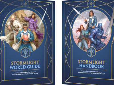
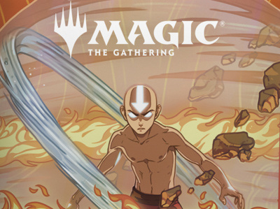
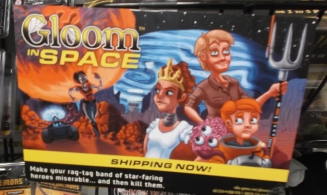
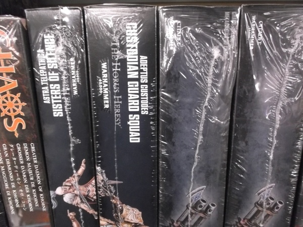
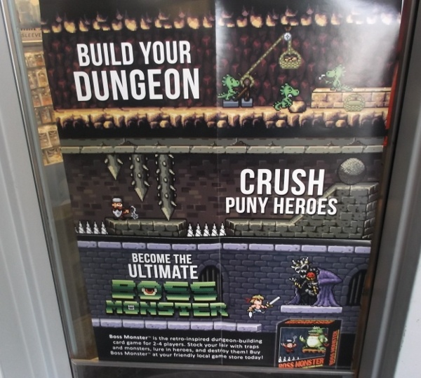
Similarly, about a third of the typical game store’s customers (and this generally applies to brick and mortar stores, the online shopper is generally more focused about what they want as they typically search for items online) come in looking specifically for products such as Dungeons & Dragons, Magic: The Gathering, Cards Against Humanity, etc. However, two thirds of those customers come in just looking for "a game" or to see "what’s new," not looking for any game in particular, just something to play that falls within their category of interest, whether it be a board game, RPG, card game or what have you. So how does a publisher catch the customer’s attention amidst all the other products in the store? Here are three suggestions:
There are, of course, a lot more things publishers can do to get customers to take a look at their products and I will discuss them in upcoming columns.
The opinions expressed in this column are solely those of the writer, and do not necessarily reflect the views of the editorial staff of ICv2.com.