 Rolling for Initiative is a weekly column by Scott Thorne, PhD, owner of Castle Perilous Games & Books in Carbondale, Illinois and instructor in marketing at Southeast Missouri State University. This week, Thorne explains game package design from the retailer viewpoint.
Just got in a boardgame today. I won't mention what its name is or who published it, save that it is a smaller publisher. I haven't opened it yet so have no idea about the quality or appearance of the contents. However, happily, it got many of the things right that small publishers miss on the packaging (though I am not quite sure if, given the antipathy with which some game stores view Kickstarter-funded games, putting a blurb on the cover announcing you were funded with Kickstarter was a wise move).
The cover art, while not great, is adequate and conveys the theme of the game, plus there is a UPC code, which, as more stores acquire POS systems, has become almost mandatory for games, indeed almost all products, to have. The box info also tells me what is inside, how long to expect a game to take, how many players and age range (I am seeing more and more games slapping on a "14 and up" label, hoping to avoid or skirt child safety regulations).
However, and there had to be a "however," there are two problems with the box packaging, one comparatively minor but one major enough that it will make the game a hard sell off the shelf.
First the minor problem. Although the publisher lists components on the box, an illustration, or even better a photograph, of the contents on the side or back of the box would really help show a potential purchaser the quality of the products inside. A list certainly helps, but "a picture speaks a thousand words."
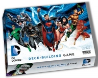
The second problem, and the one that will make this game a very hard sell to customers unless store staff takes the time to learn it and hand sell it, is the publisher's eschewing a description of gameplay in favor of more illustrations and flavor text. The box, any box (I don't care if it is a board game, RPG, laundry detergent or six count bag of athletic socks), serves as a silent salesperson for your product. The front cover (or box edge--due to shelf constraints, your game is not always going to get shelved cover side out) has to catch the customer's eye in two to three seconds. That's about how long the eye remains in one place if casually moving around and up and down store shelves. This is why you see bright colors on so many consumer products. The manufacturer knows that bright colors, among other things, catch the eye. Look at Out of the Box for good examples. Word on the Street, Pirate Vs. Pirate, Ninja Vs. Ninja, all packaged in bright colors. Cryptozoic Entertainment also has some good examples, such as their new ROFL game, as well as the DC Comics Deck Building Game. Look at how Superman and Wonder Woman leap off the DC cover, compared to the more muted colors used on Upper Deck's Marvel Legendary Game. Customers will see the DC Game first and packaging is all about getting the product into the customer's hand. Bright colors and gameplay information do a lot more to do that than do muted colors and flavor text.
The opinions expressed in this column are solely those of the writer, and do not necessarily reflect the views of the editorial staff of ICv2.com.


